This is the work blog for the KDE Visual Design Group a group of dedicated designers striving to improve community participation in design for KDE as well as design work in general for KDE applications and Plasma.

måndag 28 juli 2014

Layout Guidelines: A quick example

For planet readers: This post is written by Andrew Lake

We recently released new layout guidelines to aid with designing applications and plasmoids. So I wanted to provide a quick example of how to use the guidelines to design the layout for an imaginary calendar application.

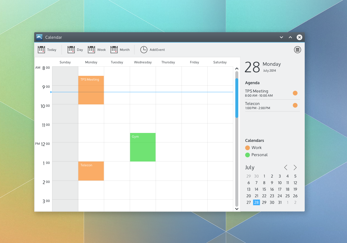
A quick design for an imaginary calendar app

To choose an application layout, the new guidelines encourage awareness of the functions and commands provided by your application as well as the structure of the content provided by your application.

So let's start with commands. Suppose we want the primary function of our calendar application to be providing a daily, weekly or monthly schedule of the user's upcoming work or personal events. The user, Sue, would also like to be able to add events to her schedule. There are many other functions for a calendar application that I'm sure we're all aware of. We're not designing in a vacuum - there are many calendar applications from within KDE and elsewhere from which to draw inspiration. For the sake of this example though, lets start with the described functions and commands.

The guidelines suggest layout patterns for simple, complex and very complex command structures. So where does our calendar app fit? Well, I wasn't quite sure either. And that's ok! Some things are tough to know until you start delving into the design work. The guidelines suggest starting with a pattern for a simple command structure when you're not sure. So that's what I did. As I started putting together a design and thinking about how Sue would use it for the purposes described, it became clear that not only were there several other desirable functions (like switching calendars, setting up calendar accounts, setting calendar colors, and more) but there are also certain commands Sue might use quite often (like switching between a day, week and month view of her schedule, adding an event and quickly getting back to today after browsing forward or back in time). So I settled on the suggested Toolbar + Menu Button command pattern for a complex command structure.

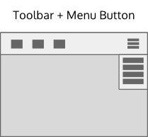
The mockup toolkit provides an example:


The content structure for a calendar is pretty much flat: Just a collection of days (with or without events). I wanted to show a single day view, a week view(7 days) or month view (28 - 31 days) as well as properties related to the current view or selection like the date, the agenda for the current day or view and the active calendars. So I settled on a Selection-Properties navigation pattern from the recommended patterns for a flat content structure


The mockup toolkit provides an example of a Selection-Properties navigation pattern combined with a Toolbar+Menu Button.


Now I have a basic layout I can use for the rest of the design work. I put what I think will be the most frequently used commands on the toolbar - Today, Day, Week and Month views as well as a command to add an event. 


Many of the other commands like setting up calendar accounts and the like are exposed through the menu button. I design a week view using the recommended design color set and occasionally checking the typography guidelines. For the properties panel. I draw some inspiration of Sebastian Kügler's great design work on the new clock plasmoid panel popup for the current date to achieve some additional visual consistency with the desktop. I also decided to add a mini month view for convenience and a legend for the active calendars (possibly directly editable?).


Put it all together and we have a quick design for an imaginary calendar application. 


It's not a complete design in any sense of the word - icons, day and month views aren't shown, nor are calendar settings and the like. But it's probably enough to, for example, start a review on the VDG forums to get feedback from our fellow intrepid designers, the usability team and/or potential developers.

Just to be clear, you still have to design. Design is a creative activity. While guidelines can provide a sandbox, it still requires creativity within that sandbox. Often that means that the best way is to just start and figure it out as you go. For me, that's usually a bumpy trial and error process which I simply accept rather than agonize about. And no, you're not allowed to declare that you're not creative! :-) 

Always feel free to ask for help or feedback on the VDG forums - it's a great place for us to learn together. This design was done using the mockup toolkit, but just use whatever tool you're comfortable with, including just sketching on paper and taking a picture of it. Don't wait. Don't hesitate. Just do. The long term hope is that these new layout guidelines will provide enough flexibility to create layouts suitable across the full spectrum of KDE applications while also helping to achieve layout consistency where it makes actually sense. Like all guidelines, it is a living document which we'll update collaboratively over time. We'll also do more examples like this in the future.

Hope this helps!


Monday Report: Creating Documentation

Yesterday we reached a small but important goal, we completed the first of our self-set tasks for this cycle, namely finishing our application layout guideline. The guideline has been presented to the community to gather feedback and was moved to the HIG wiki yesterday.
If you think something blatantly obvious has been overlooked, don’t be afraid to speak up. The guidelines can always be improved. Keep in mind though that we intend to make more visual examples available in the guidelines. As of now we were mainly concerned with the textual content of the guidelines.
The guidelines are intended to standardise which layout elements KDE applications use and to help pointing out which layout is best suited for a specific type of application.
Additionally to the release of the application layout guidelines Andrew Lake has updated the mockup toolkit with some examples of how one can use the layout guidelines in combination with the toolkit to prototype application designs.


Another project that starts to take shape is the next network system settings module. This module is intended to be one of the first with an updated design for the new system settings.
This work is in its early planning phase so if you have something important to say, chime in!

On the window decoration front Martin Gräßlin has blogged about the advances he’s made. If you haven't seen the blog post yet give it a read, it provides very interesting insights in the internals of KWin’s new decoration API. Now it’s time for us to work on the details like padding, etc. We're very pleased with the amount of progress being made, which shows again how absolutely awesome the KDE developers are.

Community

We are very happy to see the increased community activity in the forums. Last week a whole bunch of new users arrived in the forums and started to give all kinds of useful feedback and ideas.
It’s very impressive what a difference a few motivated individuals can make. We hope to integrate all of you into our workflow as good as possible and try not miss any of your ideas. If this should happen anyway don’t be afraid to voice your ideas again.

torsdag 24 juli 2014

A wild "monday" report appears …

Arguably our insanely-coolest member, Philipp Stefan contributed this "monday" report.

Yes, it has been some time since the last entry, but with the Plasma 5 release and Jens’ busy work schedule there hasn’t been much time for him to write one, unfortunately. I hope I can keep you up to date more regularly from now on. So let’s dive right in:


What’s being worked on

The work on revisiting and expanding the Human Interface Guideline on tooltips has begun. If there’s something that has always bothered you about how tooltips in KDE Applications and Plasma look and feel consider to join in. The work is still in its early stages, so now would be the best time to voice your concerns. [https://forum.kde.org/viewtopic.php?f=285&t=121892]


Martin Gräßlin has started to work on a new window decoration API for KWin and is also working to port the Breeze window decoration to C++. This should bring the necessary performance boost to make Breeze the default window theme in future releases. We can also expect one feature many love in Oxygen to be present in the new Breeze implementation: window tabs. The awesome community member EraX has stepped up and made some mockups of how window tabs could look like in Breeze.


If you have other ideas and feedback, consider to chime in!
Additionally Martin has created some tasks you can take up to help us out porting Breeze to C++. Take a look at Martin’s blog post for more information [http://blog.martin-graesslin.com/blog/2014/07/kdecoration2-the-road-ahead/]


Behind the scenes Jens Reuteberg and Heiko Tietze has started to collect information for animation guidelines. If you have an expertise in this area or are just generally interested and want to help us out try to contact them. [https://forum.kde.org/viewtopic.php?f=285&t=121993]


We migrated to KDE’s new todo-board infrastructure, todo.kde.org. It’s really nice having everything consolidated in one place and accessible with one’s KDE-Identity account. In future we also hope to migrate away from Google Docs and Hangouts. We have been looking into something like an OwnCloud installation to create, share and store documents. Nothing is written in stone though and frankly we’ve got more important things to do right now.  


What has been overlooked

We have noticed that the participation rate in the VDG forums has plummeted and only a small core has remained, which are doing awesome work! It has to be expected that participation rates decline at the end of every release cycle, when all the work gets finalized there’s not much to be discussed after all. Nethertheless, we’d like to recreate the same experience we had with the KMyMoney, the window decoration, the widget and the cursor theme.
We identified several causes that could have contributed to the decline in participation:
  • Back then the VDG forum was new – people simply got disinterested over time
  • The VDG hasn’t communicated as much as in the beginning – the process became less transparent
  • There has not been as much guidance in where to start helping out as in the beginning
We try to address these issue better from now on. We have reorganized ourselves a bit, so you can expect more blog entries from more VDG members in future. We also intend to open new “challenges” (not in the sense of a contest) at the beginning of each release cycle where the community can participate in.
Please tell us if you have ideas how we can foster a more vibrant design community in KDE, critique happily appreciated.
We also have a thread in the forums about a related issue. If you feel the same way consider to leave a comment.

Overall I can only encourage you to browse the VDG forum. There are many interesting threads that could need some community love.

söndag 13 juli 2014

The Road Ahead

Plasma 5.0 is wrapping up and we have all learned a LOT in the first few months of the Visual Design Group's existence. One thing is clear though. If any of us had any doubts about whether an open approach to visual design can produce great results, most of those doubts have been assuaged. I'm super-proud to be part of this community and the quality of the results we have produced. It is really exciting to see the participation and the optimism by everyone involved!

So one question some folks might be pondering is "What's next for the VDG?" Well I'm glad you asked. The core VDG group sat down and looked at the long term approach to supporting the Plasma desktop and KDE applications.


Plasma 5.0 is a beginning, not an end. Just like on the technical side where the focus was on the laying the foundations for the future, the same can be said for the VDG's activities as well. We worked together with the wider VDG community and the Usability group to come up with design guidelines that are now integrated into the Presentation section of the KDE HIG. This is a living document and will see continuous updates. We recently updated the typography guidelines and have just begun work on coming up with tooltip and animation guidelines. For the Plasma 5.0 release much of our focus was on trying to get the design of the building blocks in place (UI controls style, icons, colors, cursors, window decoration, etc.). These should also be considered "living" as well. We need your help to flesh out more of the fantastic Breeze icon theme effort that Uri has been leading. Design work continues on the Breeze window decoration design in the forums. The Breeze plasma theme will always need refinements and evolution as well.

Beyond the building blocks, we'll be focusing on identifying common application layout patterns, navigation patterns, as well as more localized, functional patterns to help application designers and developers build consistent, beautiful, powerful solutions. The hope is that over time we will build up a set of resources that will enable the entire KDE community to more easily create total user experiences that are both functionally and visually amazing. (About that last block in the diagram; please don't go about saying that KDE is creating an OS. We are not. That block is simply about designing the total user experience assuming all the underlying layers of the OS have whatever capability might be needed).

One important clarifier though; we don't need to wait until all these pieces are in place to create new designs or improve existing ones. We already have a great foundation to build on. There is much we can do today to improve our existing designs. More importantly, your creative ideas today will inform what we identify as desirable approaches to design both today and tomorrow. That's why we're working on the System Settings design today. That's why when a developer approaches the VDG for help we will always try to help instead of saying "hang on a bit till we get some more stuff in place". This is a continuous process of learning and improvement for everyone.

So please, don't wait around for all of this to "finish" to start sharing your ideas or helping to improve things. There is no finish line. Join in on the fun today and help to update an application design, application icons, a dialog window, a panel applet, a window decoration theme, a plasma theme, fix a visual design bug, whatever. As Jens always says, you do not need to be a "designer" to participate. Just be creative! Be positive! Share your ideas! Participate! We will walk the road ahead together, in the open, where everyone can participate, learn from each other and create a new future for community design together!