| Not at all the icons we're talking about... |
One of the first things people think of when talking visual design is icons. Now as "design" this is a very tight definition since a large chunk of it is so much bigger. But icons is a part of it all and it is something that is the most obvious change visually. Icons are also something very very difficult to do well as there is not only several very strict rules and concepts to consider while doing them, there is also a very large amount of work involved (thousands of icons for starters). Beyond that there are issues that make it even trickier.
As icons are very direct visually - they are often victim of harsh criticism (or downright harassment) but further than that the BASE theme of a distro have to follow even stricter rules if it want to be accessible to as many as possible.
Now we using Plasma do not have the huge wealth of icon themes as the boys and girls over at GTK, but we are getting there ever so slowly and today I would like to present one of the latest icon themes to get ported to KDE - Moka by Sam Hewitt.
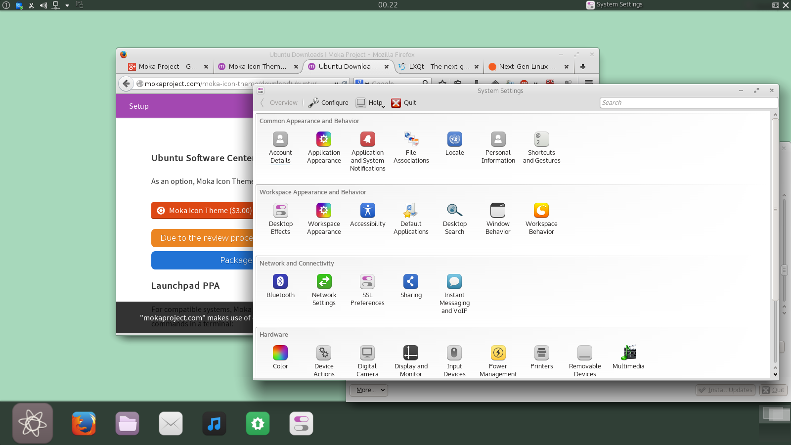 |
| Yeah so this is one of my desktops with the Moka icon theme! |
(in a perfect world I'd love for Sam to see a bump in payments OR donations (I gave 10 dollars) so remember to donate, ok?)
Anyway heres the short Interview with Sam Hewitt:
...
Who are you?
Who am I? Well, it was 1956 and in a small town in East Berlin it was a cold December day. But Berlin is always cold in December. As for me, I'm from Canada and the '90s
Nearly all the things I've found that I'm good at, I've taught myself, design
included; I dropped out of university a few years ago, half-way towards
an engineering degree that was killing my love of mathematics &
physics. It was after that that I kind of fell into design as a passion
and decided to pursue it –open source was simply an enable
Whats the story with Moka?
Moka started a little over a year ago, I can't remember exactly when. I had decided to create an icon theme, as an hobby/endeavour in teaching myself more about Inkscape –Moka then was very different from Moka now.
| ... heres the early versions of the Moka Icon theme ... |
I eventually abandoned the skeuomorphic aspects that I started with, as that was already done by others and it wasn't really my style. Changing gears, I decided to to fill a gap in the theming community of a well-designed, comprehensive icon set that was modern in style.
Then I decided I wanted to do a desktop (GTK) theme, which became Moka GTK. Purple as a motif was something no-one was doing; there are colours that are frequent in themes –blue is in many and is highly overused in my opinion.
The whole "Moka Project" is relatively recent, but with the project as a unified thing I started making other subproject and using Moka as an umbrella for it, and here we are.
What do you expect of Moka further along the line?
The future of Moka is uncertain, its fate is practically determined by my fate. Being the sole force behind Moka, should I decide to move on the project effectively halts. It's a reason I (made attempts to) set out to monetize it. If it made a few bucks I'd be motivated to work on it more since I would know there was an appreciative user base to work for. With all that there's a set of flaws I won't get into here.
As for future design plans, it's all up in the air. If I were to start anything majorly new (like a desktop environment), I'd do it outside the scope of Moka –have it hold it's own brand, to which the Moka brand could be applied.
As for future design plans, it's all up in the air. If I were to start anything majorly new (like a desktop environment), I'd do it outside the scope of Moka –have it hold it's own brand, to which the Moka brand could be applied.
Why did you port it to Plasma?
I ported/expanded Moka's icon coverage to KDE because it was something I always intended to do. A goal for the set was to be as comprehensive as possible. Moka, excluding the Faba icon set, has nearly 9500 icons (I design 7 icons for every 1 application) and I still take requests (of which I still have a huge number outstanding) for additional icons. I want people to be able to use the icons on whichever environment they want and have the same experience.
What do you think are biggest design issues with Plasma?
I tend to stay away from overtly criticising the various desktop environments, but since you asked, I'll say something brief. I can sum up the flaws (as I see it) of KDE/Plasma's design practices, thusly:
I tend to stay away from overtly criticising the various desktop environments, but since you asked, I'll say something brief. I can sum up the flaws (as I see it) of KDE/Plasma's design practices, thusly:
"Too Much Bling"
Simply put, there's too much stuff –kill that silly bouncy ball already! ;)
The amount of user interface and user-facing options, I can see as being overwhelming to newcomers, which means it's not outwardly user friendly. Sure, the style could be modernized; the look & feel is too flashy, glow-y and realistic for a design world gone flat. But were I a benevolent dictator for the project, I'd fix the user experience first and then layer on a new style.
...
More to come?
So with that we will hopefully leave Sam to notice a bump in donations and payments (did I say "pay for it, for KDE and Plasma's sake"?) and perhaps we might charm him into a making a Moka Qtcurve and color theme? My plan is to next time we talk outside of the "monday" reports I'll have a collection of my favorite free wallpapers found on the web and perhaps another short interview.
Till next time, its now two in the morning and this design is dying to get to bed!
omg i love that bouncy ball,, never kill it :(
SvaraRaderaThe problem I have with that photo is: why are the Oxygen Regular and Oxygen Bold fonts so different? I'm using two fonts as alternatives: Clear Sans and Comme (an Oxygen fork with a recent pixel-perfection patch for Plasma).
SvaraRaderaI still use my own Oxygen edition what only changes the directory and special directory icons http://i.imgur.com/4JR42.png
SvaraRaderaI couldn't stand that Dolphin icon is totally different from the directories. And since the logic behind that "folder" has more "folders" inside is absurd, I made own file cabinets what the Dolphin icon is about.
Very bling bling like Oxygen what could be slimmed down just by removing the glare elements or simply blurring them to smooth style.
And long time ago I did own KDE icon as well: http://i.imgur.com/x5nkBzR.jpg by simply playing around first with KDE logo and then building it up from the scratch.
ooo i love your directory icons ^_^
RaderaPlease, for the love of all that is good, DON'T KILL THE BOUNCY BALL!
SvaraRadera...Nice icons, by the way...
Can we have that lovely icons by default in the next kde?
SvaraRaderaPaying for free software. It sounds weird but it makes so much sense! It is free to adapt but somebody is putting effort in it. Donated a few bucks as I know making an icon set ain't like developing code...it cause much more headache to keep it consistent even though the outcome seems 'obviously simple'.
SvaraRaderaCan we have something, but the squares? They are everywhere these days.
SvaraRaderaYes you can - there are a thousand and one different icon themes without outlines. This is just one very well done icon theme and its not like I'm about to sneak into your home to install it against your will.
RaderaSo ... install say Oxygen, Flattr or Gnome (Tango) and the issue is solved?
What widgets are you using?
SvaraRaderaTop panel - from left to right.
System Tray --> Spacer --> Digital Clock --> Spacer
Some widget with current application's name?
Some widget with boxy icon?
Some widget with cross icons?
Bottom panel - from left to right.
Launcher?
Icon-Only-Taskbar?
Pager?
What Colors and Desktop Theme are you using? And that looks like Kubuntu.
After years of Gnome I decided to see what KDE is all about. So far I like it--and I installed the Moka and Faba icons. Is there a Moka/Faba color-scheme that would work with KDE?
SvaraRadera